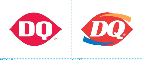
Dairy Queen's new logo

The logo is not actually new this month, it's existed since at least August 2006. But only this year is it being introduced to more than 5,600 locations worldwide and is slated for a complete rollout by the end of 2007.
I have to agree with Brand New that the new logo isn't worth the effort:
Dreary Queen
More than once the 'If it ain't broke, don't fix it' adage applies to the logos we review on this site. But I think this one takes the crown for the least broken with the worst fixin'. Dairy Queen's ellipse is one of the most highly recognizable marks, it is (was) unique, memorable and impactful. Despite this equity, Dairy Queen considered it was time to change and make the wrong moves in all the wrong placesIn the press release describing the logo change, DQ's chief brand officer said "Our original DQ logo is one of the most revered in the quick service restaurant industry." Yeah, so why wreck that?

No comments:
Post a Comment